UXW Guideline: Technical Writing, Error Messages, Brand Voice & Tone

Project introduction
The client
A leading multinational industrial equipment manufacturer.
The Goal
Provide clear and sustainable guidelines for improving written communication across the client’s website and software applications.
The team
Senior UX Writer Sarah Loigge
Myself
Timeline
2 weeks
📔 Project description
In collaboration with my team’s senior UX Writer Sarah Loigge, I created a strategic UX Writing framework for a leading multinational industrial equipment manufacturer to enhance their digital content.
The project focused on structuring clear guidelines for improving written communication across the client’s website and software applications.
By applying UX writing best practices I created comprehensive recommendations to make the technical content more user-friendly and accessible to the client’s global audience.
The UX Writing Guideline was submitted to the client in a Word Doc for review.
🧭 Project plan
Task
1. Overview of UXW best practices and do’s & dont’s.
2. Internal UXW review of the client’s website and software.
→
Goal
Provide an understanding and awareness for how and why UXW is impactful.
Highlight issues within the client’s product’s UXW as well as provide examples for improvement.
❗️Challenge ahead
Since the client didn’t have a defined voice & tone, we have decided to keep the copy neutral, clear and concise.
This helped provide deliveries quicker and made the guideline more understandable and easier to implement.
Additionally, we did not have access to all client software and had to reduce our hand-on examples to a few screenshots provided by the client.
UXW best practices
1. Clarity & Conciseness
💡 Why it matters to our client?
Clear and concise writing eliminates confusion by using simple language and getting straight to the point, which is crucial when users need to quickly understand and act on information.
If the user cannot understand what they need to do, the digital product has failed them.
Example #1: paragraphs and long text for familiar actions

In this case the body and button text are too overwhelming for the dialogue. The user needs to understand the action quickly.
Explanation for the client:
A Log In dialog is a familiar action to the user, in which case a paragraph of text is not necessary.
Example #2: stating the obvious

Explanation for the client:
Repetitive text that states the obvious would have no value for the user as opposed to a short and clear message.
2. Consistency
💡 Why it matters to our client?
Consistency in terminology, tone, and formatting creates a sense of reliability and professionalism across all touchpoints, helping users feel confident as they interact with the digital products, as well as reducing cognitive load.
Example #1: consistency when addressing users and their actions

Explanation for the client:
In this example the importance of addressing users and their actions is shown.
The software tells the user about their action: Cancel your subscription/ you want to cancel.
The user can confirm or cancel the action: My subscription.
Example #2: consistency in destructive actions

Explanation for the client:
In this classic example I stressed the importance of clarity for destructive actions.
The title and button use the same words (Trash) and the body copy explains the outcome in a concise way. The user would have no doubt about what happens when they click each button.
Lack of clarity in buttons can have dire consequences for the user.
UXW review of the client’s copy
💡 Why it matters to our client?
Although we did not receive a lot of information or examples of error states that the client wanted to improve, we still wanted to show the importance of clear and concise copy when things go wrong for the user.
Unlike an empty state, an error message can majorly disrupt the user’s use of the product.
Which is why providing a clear explanation and solution are crucial.
1. Empty state & search
Example #1: empty state
🤔 The problem
In this empty state the user does not benefit from the reason why the page no longer exists.
There are also not a lot of alternative actions a user can do, except to go back to the homepage or browse other pages.

✍️ The solution
-
Clarity of user motivation - the user wants to find a solution to the problem. Here the reason for the empty state and what to do next are prominent. The user has many options to continue from here.
-
Visual hierarchy - the user would read the title first and see the action items second (search bar and homepage button).
-
Tone - is kept neutral and polite as this was observed throughout the client’s website.
Additionally, I would change the colorful background to a neutral white in order to reduce visual clutter and emphasize the actions the user can take.

Example #2: search
🤔 The problem
This empty search state does not tell the user how to solve the problem and the body text ist not useful at all.

✍️ The solution
-
Tone - the header is more descriptive and compassionate.
-
Clarity for problem and solution - The body text explains to the user how they can navigate from here.
Looking back at this copy, I would try to reduce the body text even more (often the challenge in German).

2. Error messages
💡 Why it matters to our client?
Although we did not receive a lot of information or examples of error states that the client wanted to improve, we still wanted to show the importance of clear and concise copy when things go wrong for the user.
Unlike an empty state, an error message can majorly disrupt the user’s use of the product. Which is why providing a clear explanation and solution are crucial.
Example #1: different system errors, same messaging
🤔 The problem
These 2 system error toasts are very lengthy, in which case the most important message gets lost - there is a system issue that is still being worked on.
The technical terminology concerning KPIs might also be overwhelming to some users.

✍️ The solution
-
Clarity & Conciseness - the message is reduced to 2 sentences without withholding information.
-
The message is reduced to the most important information - the issue persists and is being worked on.

❗️Challenge ahead
Depending on the specific system issue there will be a need to use technical terms like KPIs or more details regarding the specific issue in order to keep transparency with the user.
Example #2: system error and updates
🤔 The problem
In this system error the user will benefit from knowing when the next update on the specific issue will be released. The issue could be different across users.
This error toast has a polite tone, yet it gets lost in the length.

✍️ The solution
-
Clarity & Conciseness - the message is reduced to 3 sentences without withholding information.
The message is reduced to the most important information - the issue is known and is being worked on, as well as when the next update will be. -
Visual Hierarchy - the status update is very important for the user and is in bold text at the bottom of the message.

❗️Challenge ahead
In this case I decided to not include the date and time when the issue was identified, since I assumed it is not important for the user. However, this creates lack of transparency and depending on the issue, this information could be of importance.
For next time I would make sure to check in with the development team to clarify what information is important.
Example #3: very little technical information available
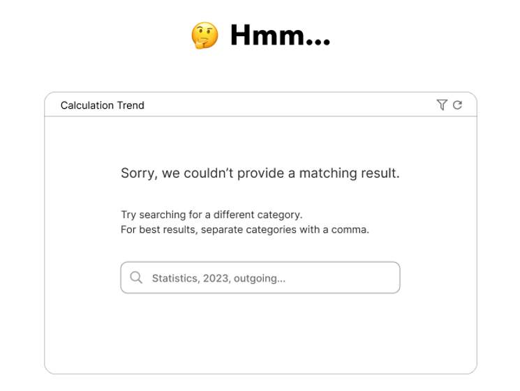
🤔 The problem
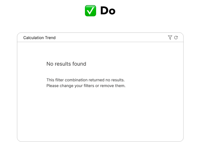
The user doens’t get any results due to the filters they applied.
-
The client has not provided any more information to us - what can be added to this dialog?
-
Can it be changed?
-
What else does the user needs to know?

❗️Challenge ahead
I decided to add a more descriptive header and body, typical for an error message. I also added a search bar so the user might find a way out.
However, this was not the correct solution to this dialog.

✍️ The solution
-
Remaining within constraints - since so little is known about the technical possibilities of this dialog, the best solution a UX Writer can provide is to keep the copy as transparent and simple as possible.
No further UX solutions are applicable here, unless the client would have provided us with more information.

Impact
The UX Writing Guideline successfully established our team as trusted advisors on content strategy for this major client.
While direct implementation metrics are not available, the key impact was a significant shift in the client's perspective - they now actively value UX Writing expertise and demonstrate openness to content recommendations for their digital products.
This cultural change positions us to influence future content decisions across their website and software platforms.
Learnings
✅ What worked well
-
Applying UXW principles in order to improve common copy issues.
-
Compiling a comprehensive UXW Guideline that the client can easily relate to when working on their future UX Writing.
-
Collaborating with Sarah Loigge and learning along the way.
❌ What didn't work well
-
Not considering technical constraints for UX Design when working on screens where we had very little information from the client.
-
Having no contact with the client’s development team for more context.
✍️ For next time
-
I’d like to ask more questions around technical constrains.
-
I’d like to dive deeper into UX Writing solutions and establish a glossary to make the guideline more sustainable for the client.
